

Zapship/SwiftLabels - Label Website Design
Client
BigDaddy - Zapship/Swift Labels
Timeline
Feb '23 - Mar '23
Role
Brand Design, including Logo, Website, Dashboard
Outcome
Doubling Revenue in just 1 month of release, Increases Customer Retention and Sign Ups by 73%

Presenting the freshly redesigned identity of ZapShip, a powerful transformation that has yielded remarkable results. Through this strategic evolution, ZapShip has demonstrated a substantial and proven 73% increase in both customer retention and signups. Moreover, this visionary rebranding initiative achieved the extraordinary feat of doubling revenue within a mere month of its launch. Remarkably, this growth shows no signs of slowing down, as ZapShip continues to exhibit exponential month-over-month expansion.

The Vision :
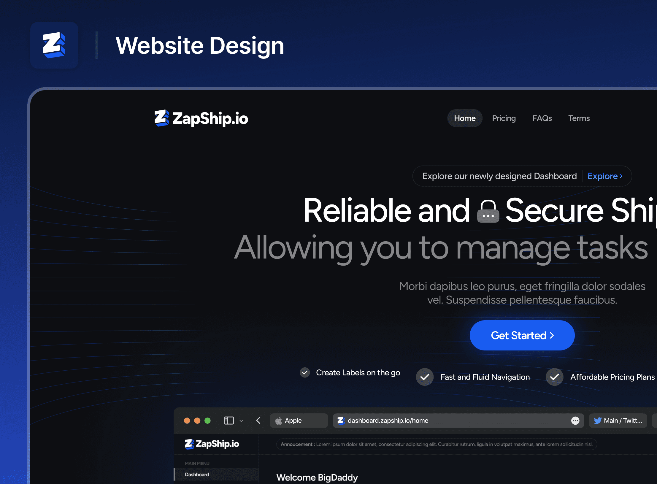
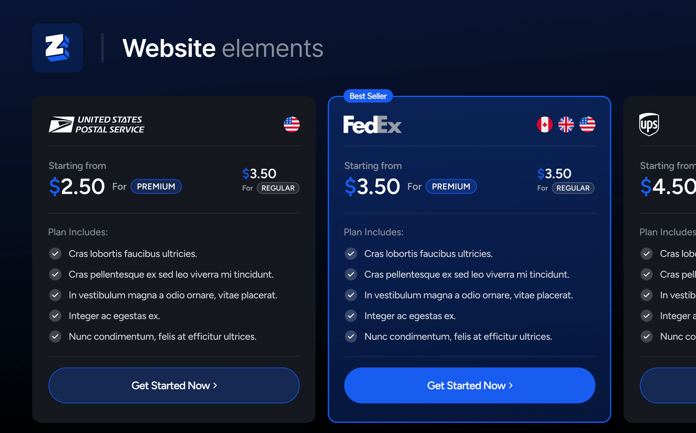
We've meticulously crafted a timeless and user-centric design for our website. Our approach combines a modern aesthetic with timeless elements, leaving a lasting impression on users that goes beyond just the brand itself.
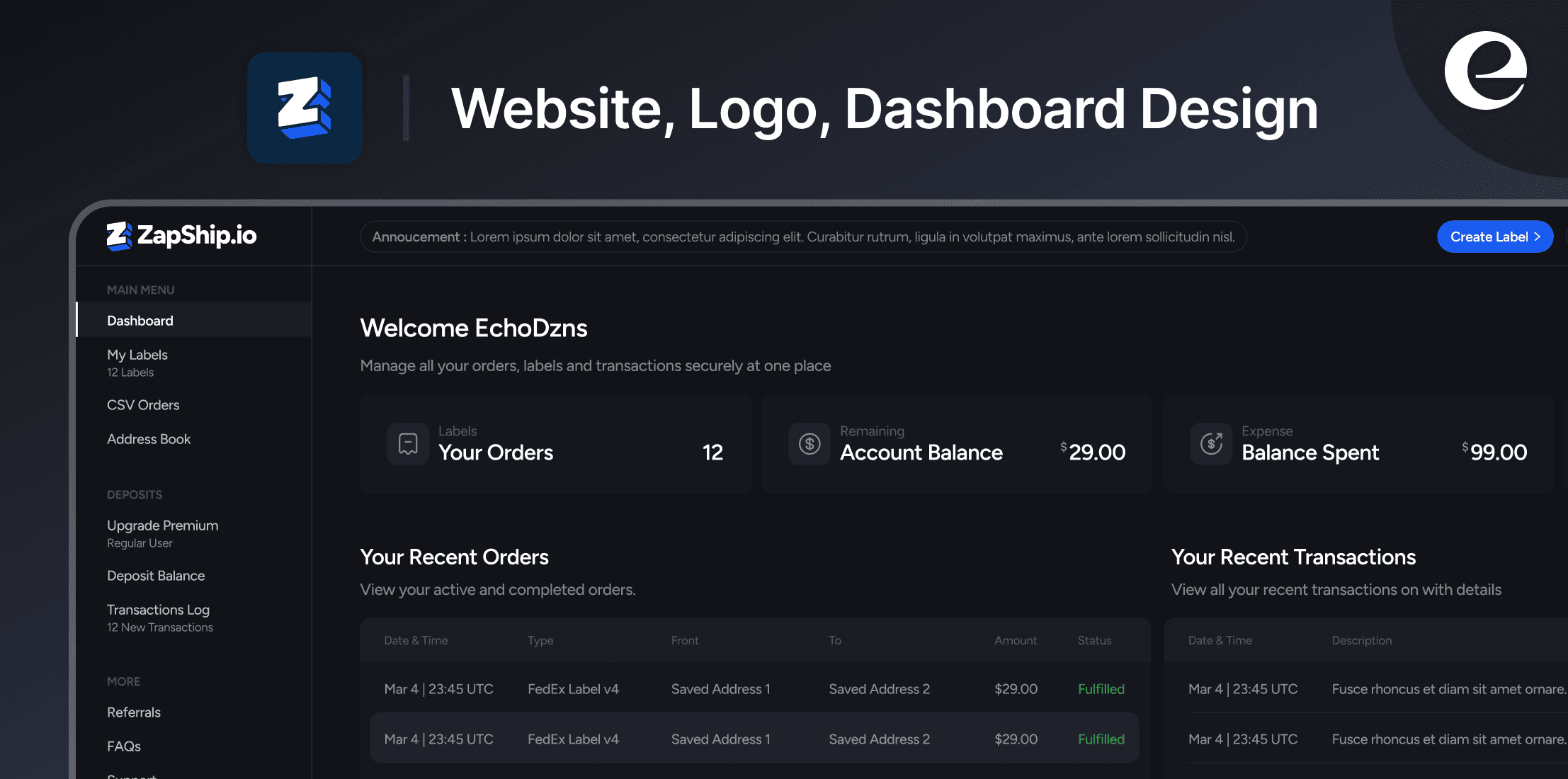
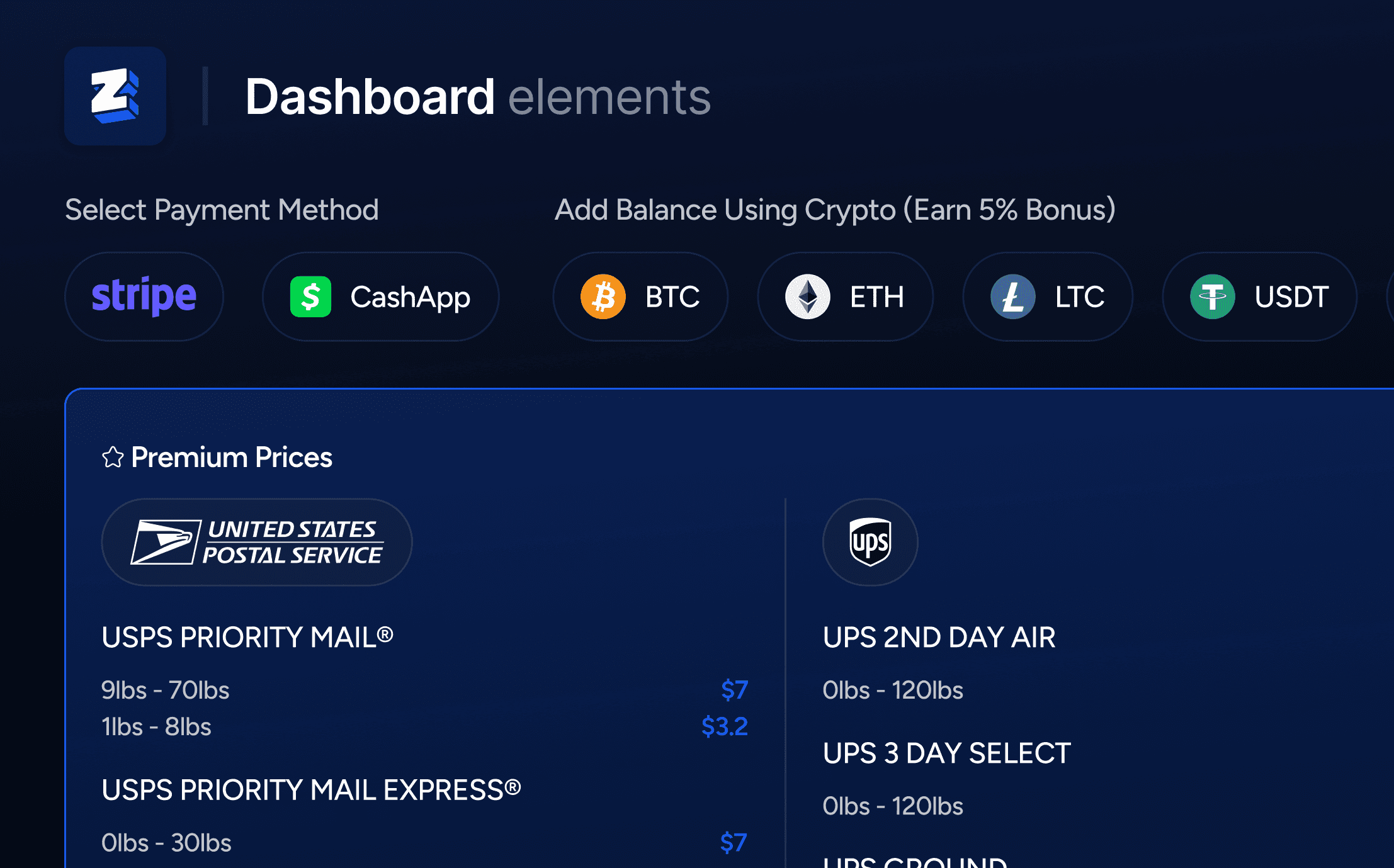
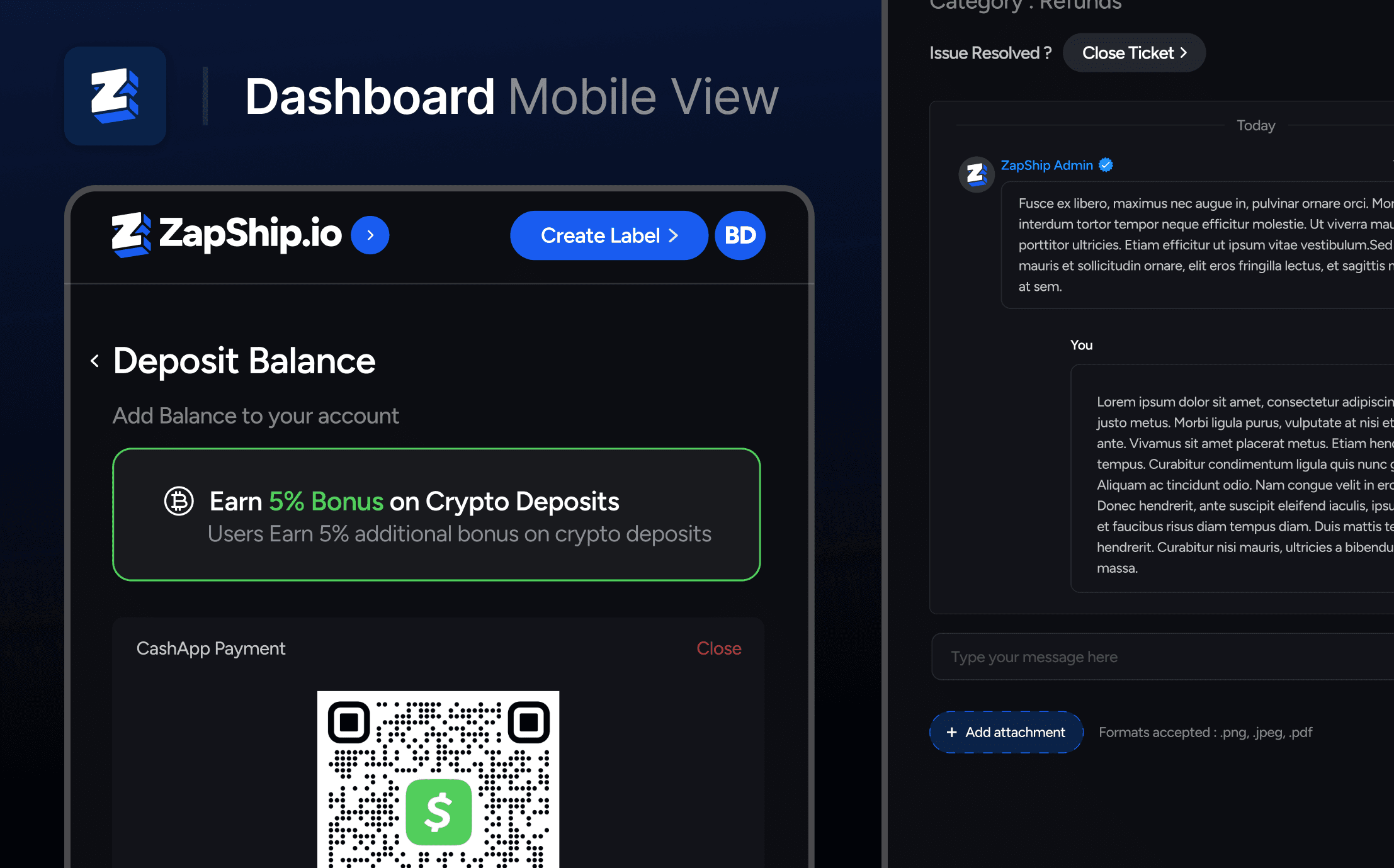
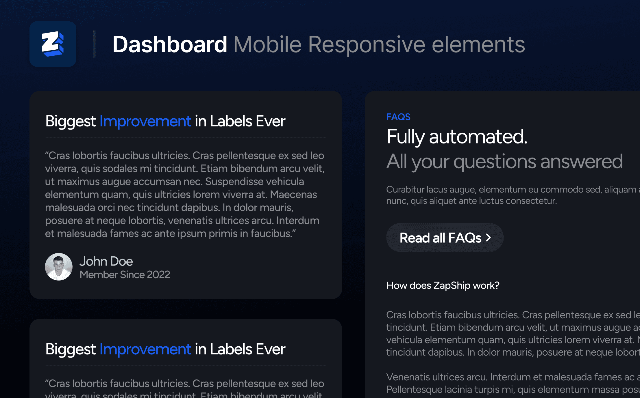
Our Dashboard is equipped with all the essential tools, offering customers a comprehensive preview of our service even before they sign up. This not only enhances user understanding but also guarantees a growing user base for our service.
Consistency in design is a hallmark of every page, ensuring that users perceive our website as a cohesive, professional package of services.
Our commitment to excellence extends to the minutest of details, culminating in the creation of one of the most exceptional label services available today.
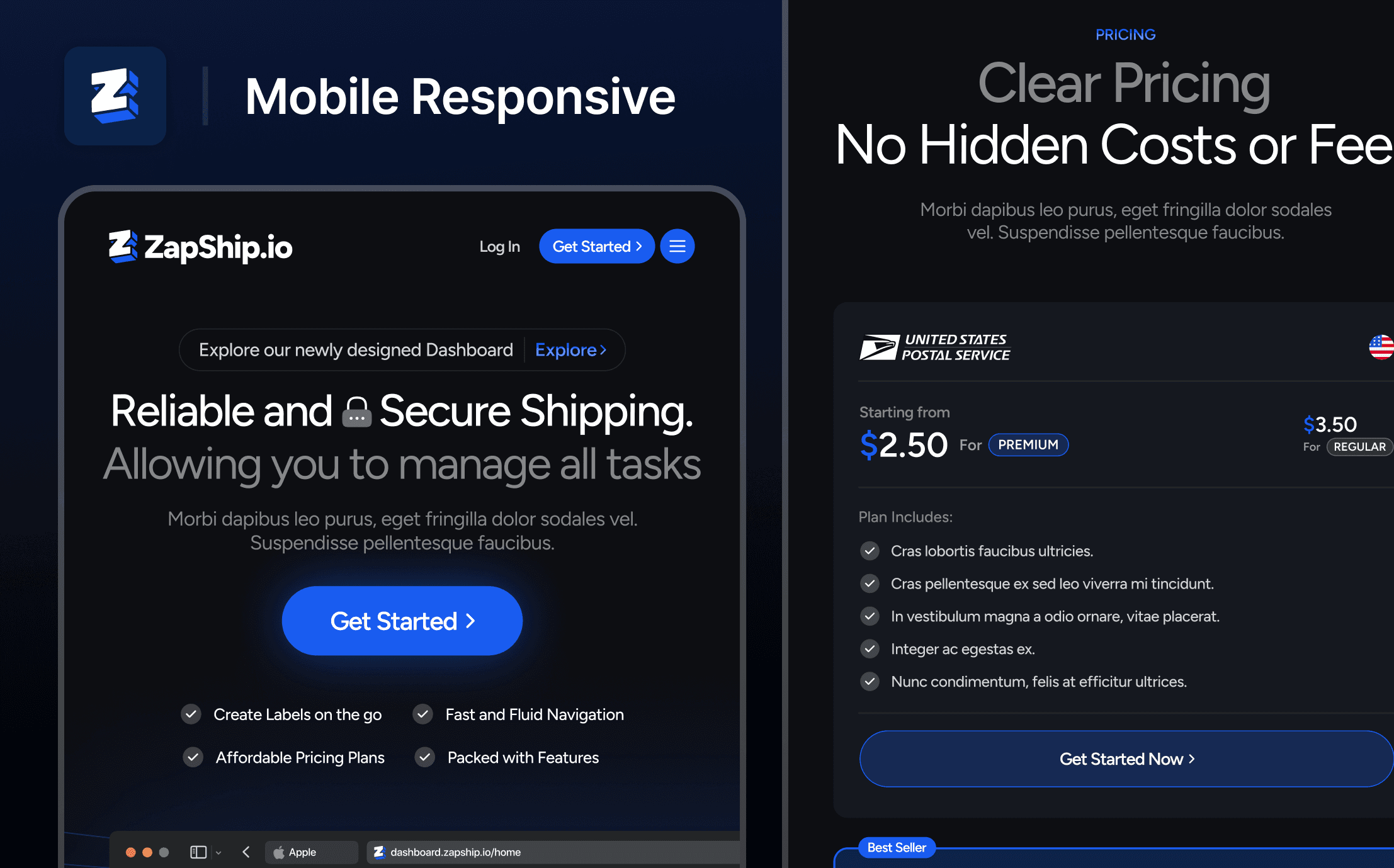
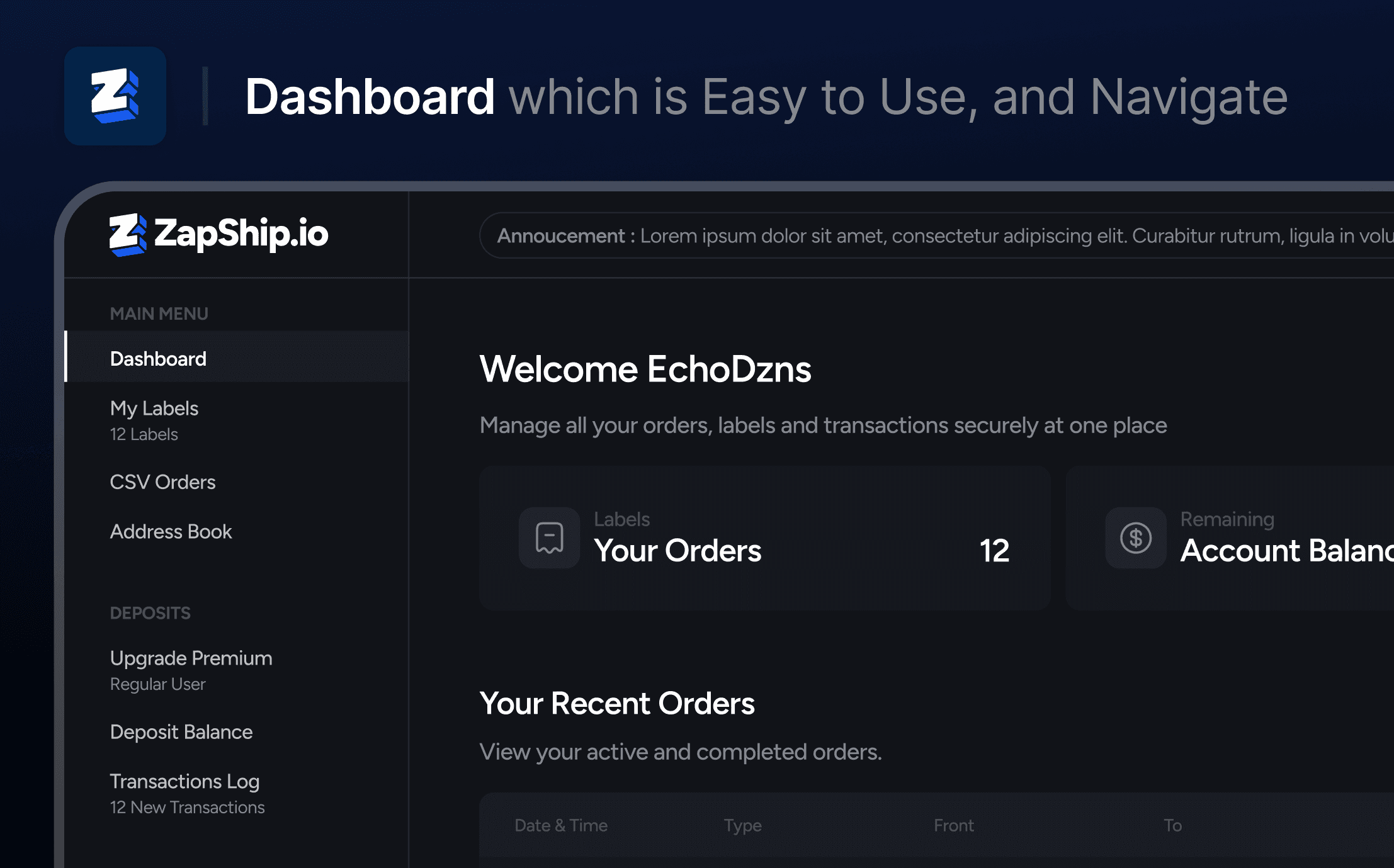
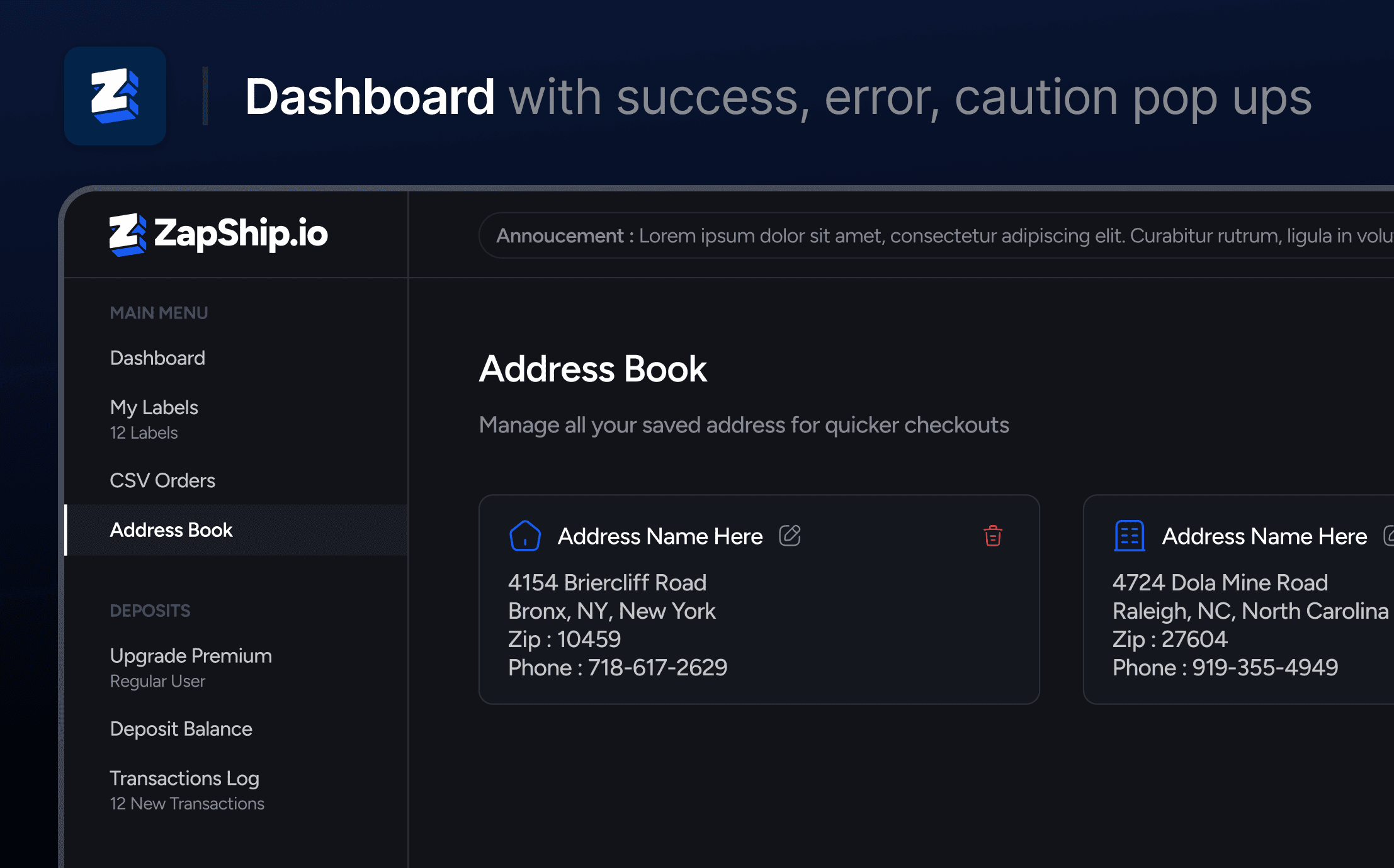
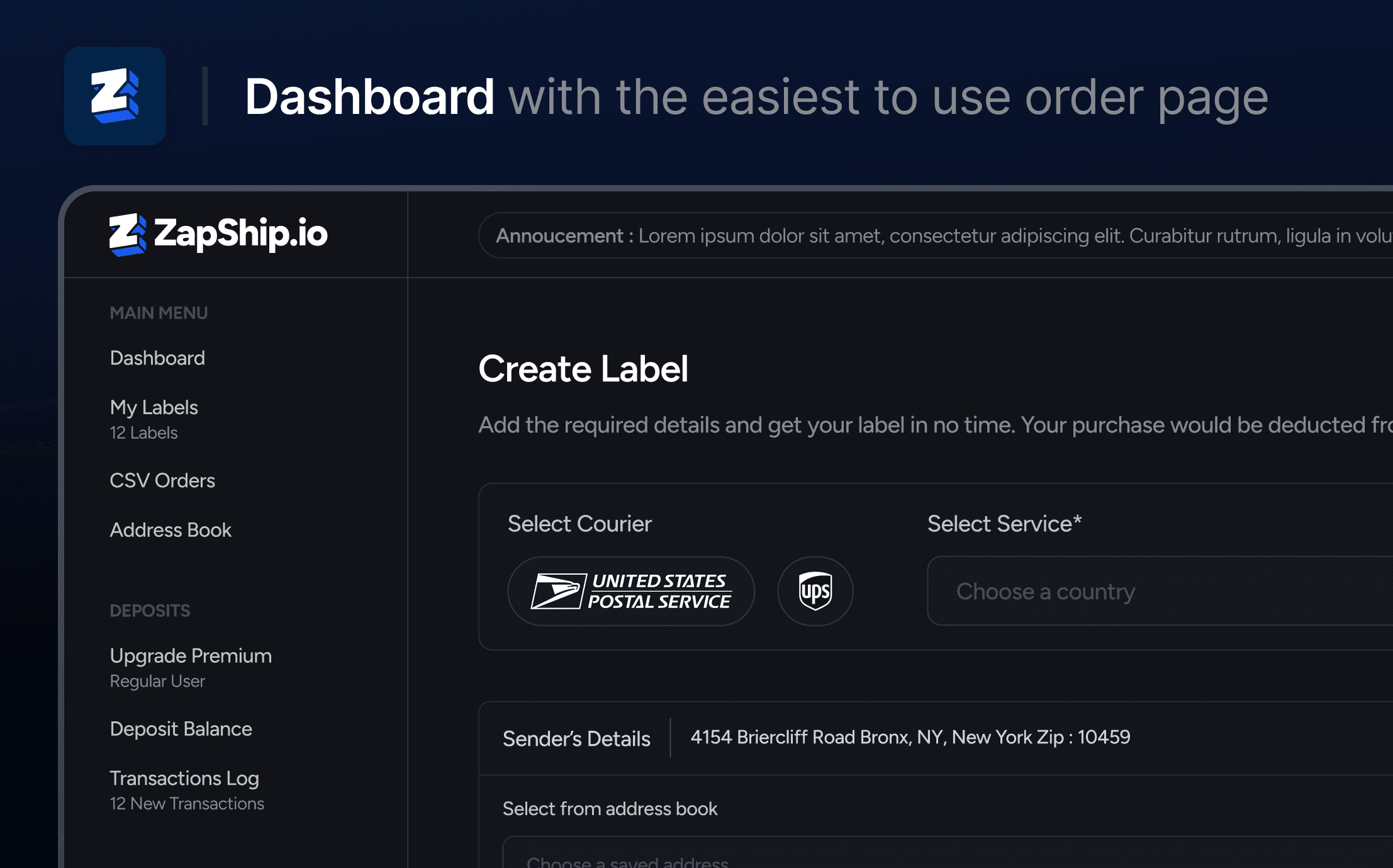
The dashboard stands as the central hub of our service, where users engage with our offerings daily.
Our primary focus has centered around three key objectives to enhance the dashboard experience:
Enhanced Design Layout: We've optimized the design layout to provide users with immediate access to critical information, enabling them to grasp the essentials at a glance.
Streamlined Ordering Process: We've minimized friction during the order placement process, ensuring a seamless and efficient experience for our users.
User-Friendly Colors and Layouts: Our color schemes and layouts have been thoughtfully designed for ease on the eyes, allowing users to comfortably spend more time navigating and utilizing the dashboard.

Zapship/SwiftLabels - Label Website Design
Client
BigDaddy - Zapship/Swift Labels
Timeline
Feb '23 - Mar '23
Role
Brand Design, including Logo, Website, Dashboard
Outcome
Doubling Revenue in just 1 month of release, Increases Customer Retention and Sign Ups by 73%


Presenting the freshly redesigned identity of ZapShip, a powerful transformation that has yielded remarkable results. Through this strategic evolution, ZapShip has demonstrated a substantial and proven 73% increase in both customer retention and signups. Moreover, this visionary rebranding initiative achieved the extraordinary feat of doubling revenue within a mere month of its launch. Remarkably, this growth shows no signs of slowing down, as ZapShip continues to exhibit exponential month-over-month expansion.

The Vision :
We've meticulously crafted a timeless and user-centric design for our website. Our approach combines a modern aesthetic with timeless elements, leaving a lasting impression on users that goes beyond just the brand itself.
Our Dashboard is equipped with all the essential tools, offering customers a comprehensive preview of our service even before they sign up. This not only enhances user understanding but also guarantees a growing user base for our service.
Consistency in design is a hallmark of every page, ensuring that users perceive our website as a cohesive, professional package of services.
Our commitment to excellence extends to the minutest of details, culminating in the creation of one of the most exceptional label services available today.


The dashboard stands as the central hub of our service, where users engage with our offerings daily.
Our primary focus has centered around three key objectives to enhance the dashboard experience:
Enhanced Design Layout: We've optimized the design layout to provide users with immediate access to critical information, enabling them to grasp the essentials at a glance.
Streamlined Ordering Process: We've minimized friction during the order placement process, ensuring a seamless and efficient experience for our users.
User-Friendly Colors and Layouts: Our color schemes and layouts have been thoughtfully designed for ease on the eyes, allowing users to comfortably spend more time navigating and utilizing the dashboard.


Zapship/SwiftLabels - Label Website Design
Client
BigDaddy - Zapship/Swift Labels
Timeline
Feb '23 - Mar '23
Role
Brand Design, including Logo, Website, Dashboard
Outcome
Doubling Revenue in just 1 month of release, Increases Customer Retention and Sign Ups by 73%


Presenting the freshly redesigned identity of ZapShip, a powerful transformation that has yielded remarkable results. Through this strategic evolution, ZapShip has demonstrated a substantial and proven 73% increase in both customer retention and signups. Moreover, this visionary rebranding initiative achieved the extraordinary feat of doubling revenue within a mere month of its launch. Remarkably, this growth shows no signs of slowing down, as ZapShip continues to exhibit exponential month-over-month expansion.

The Vision :
We've meticulously crafted a timeless and user-centric design for our website. Our approach combines a modern aesthetic with timeless elements, leaving a lasting impression on users that goes beyond just the brand itself.
Our Dashboard is equipped with all the essential tools, offering customers a comprehensive preview of our service even before they sign up. This not only enhances user understanding but also guarantees a growing user base for our service.
Consistency in design is a hallmark of every page, ensuring that users perceive our website as a cohesive, professional package of services.
Our commitment to excellence extends to the minutest of details, culminating in the creation of one of the most exceptional label services available today.


The dashboard stands as the central hub of our service, where users engage with our offerings daily.
Our primary focus has centered around three key objectives to enhance the dashboard experience:
Enhanced Design Layout: We've optimized the design layout to provide users with immediate access to critical information, enabling them to grasp the essentials at a glance.
Streamlined Ordering Process: We've minimized friction during the order placement process, ensuring a seamless and efficient experience for our users.
User-Friendly Colors and Layouts: Our color schemes and layouts have been thoughtfully designed for ease on the eyes, allowing users to comfortably spend more time navigating and utilizing the dashboard.


© 2023 Designed by @echodzns